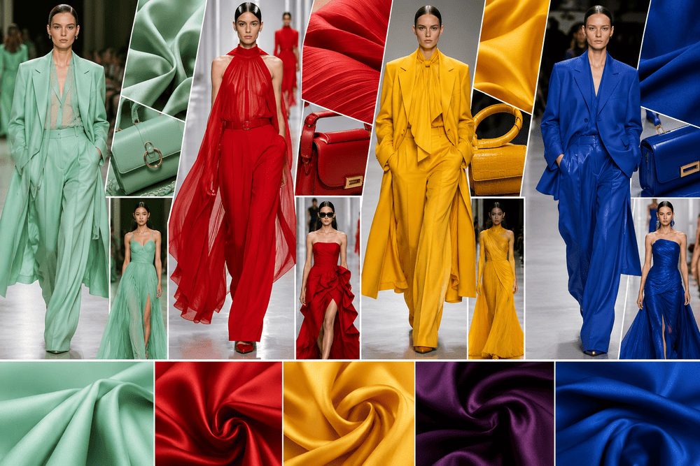
The 2026 fashion calendar presents a sharp departure from the muted minimalism that dictated previous seasons. Designers across Paris, Milan, and New York consciously injected highly saturated pigments and digital-inspired pastels into their collections. This calculated shift reflects a broader cultural desire for optimism and unapologetic self-expression. The current forecasting cycle highlights a deep fascination with extremes. We see ultra-calming greens sharing the stage with hyper-stimulating blues. Analysts confirm that consumers want garments that trigger an immediate emotional response. The industry is moving past basic beige and camel. A new spectrum of hero shades now dominates the retail landscape.
The Dominance Of Mint Green And Toothpaste Dressing
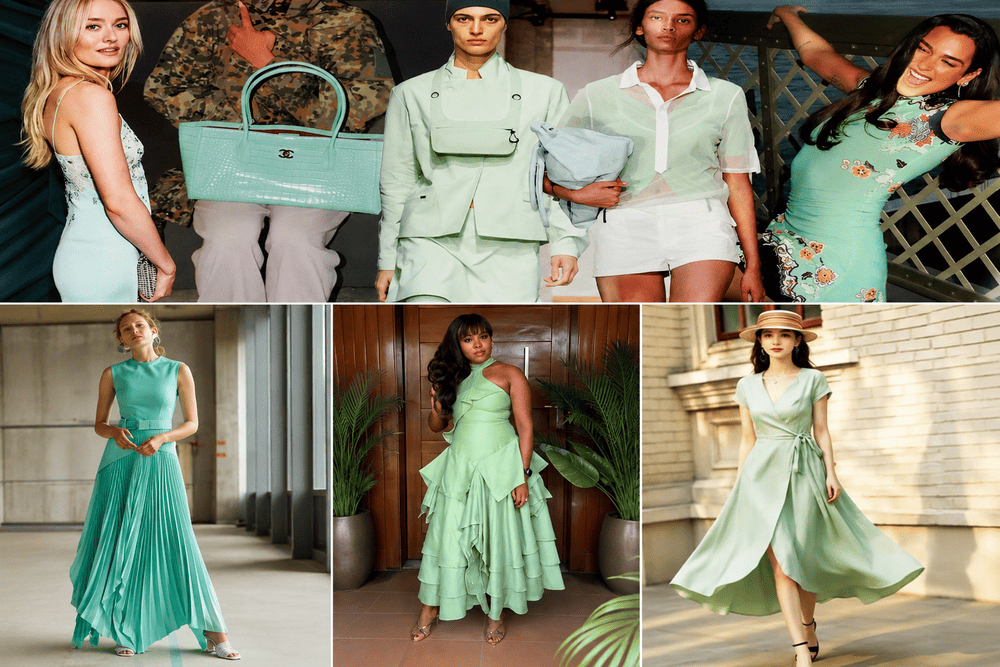
Mint green commands the highest visibility this year. Analysts track this shade as the defining pastel of the spring and summer collections. British publications quickly labeled this movement “toothpaste dressing” resulting from its refreshing, slightly synthetic quality. The 2026 iteration of mint carries a distinct jelly-like finish. It merges the organic feel of natural foliage with the artificial glow of a backlit screen.
Major heritage houses utilized this particular green to modernize classic silhouettes. Chanel sent heavily sequined mint tweed suits down the runway, proving that pastel tones can carry serious structural weight. Fendi manipulated sheer organza in pale mint to craft fluid, dreamlike dresses that moved effortlessly with the wearer. Dior incorporated the shade into architectural bubble skirts. This hue functions brilliantly as a modern neutral. A pale green cashmere sweater or a crisp poplin shirt pairs seamlessly with dark denim or charcoal trousers. The high versatility of mint guarantees its long-term presence in luxury retail.
Cobalt Blue And The Legacy Of Yves Klein
If mint green provides the calm, cobalt blue delivers the adrenaline. The electric blue hue completely saturated the seasonal runways. Lanvin presented collections featuring catwalks that matched the striking cobalt garments perfectly. Bottega Veneta, Chanel, and Givenchy integrated massive blocks of this intense blue into their outerwear and eveningwear presentations.
Fashion historians draw direct parallels between this current trend and International Klein Blue (IKB). French artist Yves Klein developed IKB in the late 1950s to suspend pure ultramarine pigment in a way that preserved its shocking clarity. Today’s cobalt blue achieves a similar visual impact. The color strikes a rare balance between the natural depth of the ocean and the synthetic intensity of digital media. Wearing a cobalt blue trench coat or a sharp fitted blazer wakes up an outfit instantly. Retailers report that cobalt pieces sell out faster than traditional black or navy alternatives, confirming the consumer appetite for high-impact styling. Read the broader implications of these pigment choices in our deep breakdown of runway color trends from the European fashion capitals.

Unexpected Pairings Reconfigure The Color Wheel
Styling these new colors requires ignoring outdated rules. The most photographed looks outside the show venues featured jarring, unexpected color combinations. Red and purple emerged as the defining duo of the summer. Balenciaga presented haute couture looks merging heavy scarlet fabrics with deep royal purple. Carolina Herrera constructed column maxi dresses with alternating tiers of lavender and bright cherry red. These two colors sit close to each other on the color wheel, creating a rich, deeply saturated visual experience.
Another highly favored combination pairs soft sage green with rich butter yellow. These pastel tones complement each other naturally without feeling overly saccharine. Fashion insiders style sage green trousers with pale yellow knitwear to achieve a relaxed, highly sophisticated appearance. Deep burgundy, which has transitioned from a passing trend into a permanent staple, now pairs heavily with icy, frosty blue. The contrast between a warm, bloody oxblood leather jacket and a cool, pale blue silk skirt provides incredible visual tension.
Earth Tones Evolve Into Sophisticated Neutrals
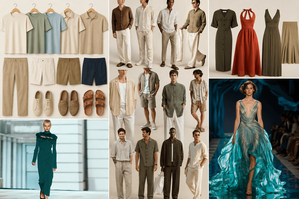
The demand for organic, grounded colors remains strong for the colder months. Forecasters point to a particular palette of warm, earthy shades that replace standard greys and browns. Cocoa powder and deep burnt olive offer a richer alternative for heavy outerwear and structured wool trousers. These shades project a quiet confidence. They work exceptionally well on sustainable fabrics, heavy linens, and upcycled wool blends.
Acacia, a bright yellow with distinct green undertones, provides a necessary burst of light during the darker winter months. Designers utilized this exact yellow-green to craft heavy jersey dresses and thick cashmere sweaters. Muted clay emerged as another favorite. This powdery, floral-adjacent color brings a delicate touch to heavy winter garments. Khaite utilized muted clay for structured lace dresses, offering a soft counterpoint to the severe weather. Read more about the psychological impact of these choices in a thorough fashion color trends report from leading industry analysts.
The Influence Of Transformative Teal
Trend forecasting agencies uniformly declared “Transformative Teal” as a defining color of the decade. This deep blue-green hybrid radiates calm authority. The shade symbolizes ecological regeneration and a forward-looking mindset. Transformative Teal bridges the gap between the playful nature of mint green and the severe intensity of cobalt blue.
Designers favor this dark teal for formalwear and structured leather goods. A heavy silk gown in this shade reflects light beautifully, appearing almost black in low light and flashing bright blue-green under camera flashes. Footwear brands incorporate the color into suede loafers and glossy patent leather boots. The shade carries enough visual weight to anchor a detailed outfit without overwhelming the wearer.
The Material Impact On Color Perception
Color never exists in a vacuum. The fabric dictates how the eye perceives the dye. The 2026 collections proved that texture acts as an amplifier for pigment. A flat cotton t-shirt in cobalt blue looks completely different than a heavy velvet coat dyed in the exact same vat. The runways favored high-shine materials to push these new colors to their absolute limit. Glossy patent leathers, liquid silks, and dense sequins give mint green its wet, jelly-like appearance.
Matte finishes serve a different purpose. Heavy wools, raw denim, and brushed cashmere absorb light, giving shades like Transformative Teal and cocoa powder their deep, grounding presence. Designers frequently mixed contrasting textures within a monochromatic outfit. A chunky knit sweater paired with a bias-cut satin skirt, both in the exact same shade of pale sage green, creates depth through light reflection rather than color contrast. This sophisticated technique allows the wearer to embrace a head-to-toe color trend without looking flat or costumey.
The Psychology Behind High-Voltage Pigments
The collective shift to intense, saturated color signals a broader psychological reaction to global events. Analysts frequently note that during periods of intense technological and social restructuring, creative industries lean heavily on bold, symbolic visual elements. Cobalt blue wakes the brain up. It triggers a physical response similar to a strong shot of caffeine. The color forces the viewer to pay attention.
Conversely, the massive popularity of muted clay, pale mint, and acacia yellow answers a deep cultural longing for lightness and relief. Pantone pointed out a shade called Cloud Dancer—a crisp, calming off-white—as a mental “blank canvas” for the year. In a retail environment saturated with loud marketing and sensory overload, slipping into a perfectly fitted mint green coat offers a moment of manufactured peace. The fashion industry carefully balances these two opposing needs: the desire to stand out aggressively and the need to retreat into quiet comfort.
Redefining The Autumn And Winter Sensibility
Winter dressing traditionally relies on a depressing rotation of black, navy, and charcoal. The Fall/Winter 2026 presentations violently disrupted this habit. Designers refused to let the dropping temperatures dictate a somber palette.
Eggplant emerged as a dominant force for heavy winter textiles. Tory Burch showcased sweeping gowns in this rich, bruised purple. Carolina Herrera used eggplant to construct rigid, structured skirts with polished satin finishes. The shade carries the same formal weight as black but offers far more visual interest under the harsh artificial lighting of winter events.
Pumpkin orange made a surprising appearance as a luxury shade. Calvin Klein presented sleek, mock-neck dresses in this vivid hue, proving that orange can look sophisticated when the fitting remains sharp and clean. Marni utilized pumpkin for silk shift dresses, demonstrating its viability as a transitional color from late autumn into deep winter. These rich, harvest-inspired colors warm up pale winter skin and inject life into dreary city streets.
Translating Runway Brights Into Corporate Environments
Office dress codes face a serious update as these new shades filter into professional environments. Traditional corporate environments historically banish loud colors in favor of muted greys and strict navy blues. The 2026 collections offer a highly effective compromise. The introduction of muted clay and sage green provides a safe entry point for introducing color into boardrooms. A structured blazer in a soft sage green paired with matching wide-leg trousers maintains absolute professionalism. At the same time, it signals a high level of fashion fluency.
Cobalt blue offers a different utility in the workplace. It projects authority and extreme confidence. Many female executives now reach for a cobalt silk blouse to wear under a dark charcoal suit. This flash of intense color draws the eye up to the face and commands attention during presentations. The key to pulling this off involves strict proportion control. Let the single bright garment act as the focal point, keeping all other accessories and footwear completely neutral. This calculated styling prevents the color from overpowering the individual wearing it.
The Resurgence Of Pastel Outerwear
Outerwear typically defaults to safe, dark shades designed to hide dirt and resist harsh weather. The latest runway presentations aggressively challenged this practical mindset. Oversized wool coats in pale mint green and soft lavender appeared on the streets of Milan and Paris. These pastel coats create a striking visual contrast against the dreary, grey backdrop of a typical winter day.
Investing in a brightly colored winter coat requires a shift in consumer mindset. Shoppers must view the coat as the entire outfit rather than just a protective layer. A pale blue cashmere wrap coat worn over simple dark denim instantly transforms a basic weekend outfit into a highly photographed street style moment. To maintain the pristine condition of these lighter colors, luxury brands now treat their wools and cashmeres with advanced invisible coatings that repel water and resist staining, merging high fashion aesthetics with daily utility.
Adapting The 2026 Palette For Daily Wear
Integrating these precise runway trends into a functional wardrobe requires strategy. The most effective approach involves using high-impact colors as deliberate accents.
| Base Garment | Color Addition | Styling Application |
| Charcoal Grey Suit | Mint Green | A crisp cotton poplin shirt worn under the jacket |
| Dark Indigo Denim | Cobalt Blue | A structured wool jacket or heavy knit sweater |
| Camel Trench Coat | Transformative Teal | A large silk square scarf tied around the neck |
| Navy Midi Dress | Cherry Red and Purple | Burgundy leather boots and a lavender clutch bag |
Adopting a new color palette does not require a complete wardrobe overhaul. Introducing a pair of bright cobalt blue leather sneakers or a pale mint green handbag refreshes existing basics instantly. The 2026 color forecast encourages experimentation and personal expression. The rigid minimalism of the early 2020s has officially fractured. The current fashion format rewards bold choices, sharp contrasts, and a willingness to wear pigments that demand attention.